Announcement Portal
Creating a internal tools dashboard to display Announcements
About oVice Announcement Portal
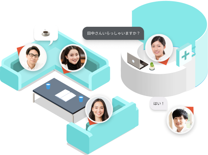
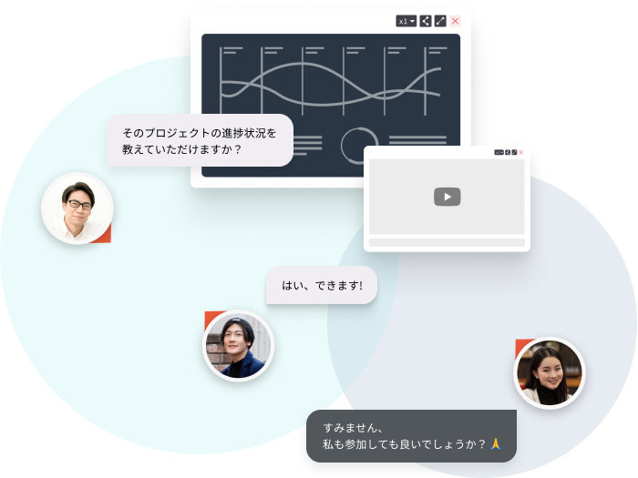
oVice combines Voice, Video, Virtual, and Office into an integrated platform.
Born in Japan out of the need to communicate in a remote world, oVice grew to encompass a devoted following in Japan, Korea, and Vietnam. With over 2,300 companies and approximately 1 million users, oVice was able to connect work, education, community, and events together via the web.
With our current system, the only way users can find announcements or information about downtime, events, or updates is via an email. Although our click-to-open rates in Japan hovered around 9-10%, but those were only admin users of oVice. With our user interview findings, we had found out that many regular users had no idea about new features, or would be very frustrated when finding platform downtime, and not knowing if it was a bug or a planned maintenance. We wanted to create a way for our internal members to let all users know of important information at any time they log into oVice.
Team: Product Designer (Self), 1 Product Manager, 2 Engineers
Timeline: Sept 2022- Oct 2022 (Initial Design), Nov 2022- Feb 2023 (Phase 2 Iteration & Rollout)
Tools: Figma, Notion, Linear, Asana, Slack
Use Cases for Announcement Portal
An oVice internal admin wants to send announcement to all users to notify them of important product information.
oVice users want to receive the urgent product information from the oVice in their selected language preference.
oVice admins can add a link in the announcement for users to read further about the corresponding product information.
The Problem
With agile development at a startup moving quick, we started to come across issues built up with technical debt in the months of July-August 2022, suggesting that we might have been moving too quick as a company. With these incidents, our users were not notified in a direct manner of any downtime as the protocol in place was to draft an email, translate into multiple languages, and then send it to admin users. We would then depend on the admins to spread the word to their team members. This was wholly not a great solution, and it was only a bandaid that was forgivable for the first incident. Our users not knowing what was going on started to cost us their trust, especially as incidents continued to happen.
Benefit to oVice
Make sure information reaches all the target users
By creating an in-app announcement system to replace manual emails, Twitter posts, and press releases, we can make sure vital information can reach all users who are actively using oVice.
Establish a way to reach out specific users
An in-app announcement system can also be used as a way to collect feedback and data from specific users.
Benefit to oVice Users
An easy way to receive important info from the organization
As the announcement banner will be visibly displayed in each workspace, users can quickly find the information without taking extra steps to search for the latest information coming from the organization regarding bugs, updates, or features.
The Goal
To solve this problem, we moved priorities on our roadmap to create the Announcement Dashboard for our internal team members. We wanted the ability to quickly send out notifications targeted to specific spaces by language.
We started with the MVP of a banner alert that could display information about what was happening (planned maintenance, system downtime, special events), with a link to read more. This was particularly challenging to design as there were 3 main languages to account for within our internal team members and users. On the back end, we needed to ensure the correct users were targeted with the correct information in their designated workspace.
-
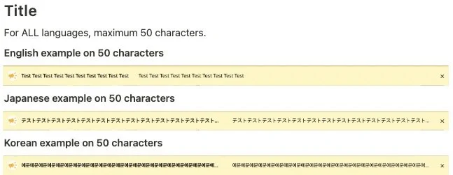
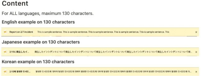
We needed to ensure the banner and dashboard was legible in 3 main typescales- Japanese, Korean, and English. Japanese needed to be the focus as it would reach the most users making up 92% of our user base.
-
As the oVice Customer Success teams needed to target specific workspaces and regions, we needed to ensure the design included a way to create groupings of workspaces for the banner to appear in on the dashboard side.
-
Design was tasked with creating announcement categories, along with rules regarding a max amount of displayed banners and the hierarchy of category and display.
Questions to Keep in Mind

Discovery and Analysis
Stakeholder and Internal User Interviews:
I spoke with our three major customer success teams in Korea, Japan, and Global (English) to understand each team’s current process of notifying their sector of users of events via email, and summarized the following:
Currently it would take about 15 minutes to release a email regarding system down time.
There was no way for the user to tell if the problem was affecting only them, or all oVice users.
Multiple emails and bug reports would flow in from the users, and it would take some time to review and see if there was more than one problem occurring.
Our CS team relied on the admin members of oVice that signed up for email updates to open the email sent, and pass the information along to their teams.
Our CS teams were not able to add updates to the oVice main landing page due to technical limitations. However, most oVice users would access their workspaces directly, and not through our landing page.
Users especially in Japan felt more comfortable with a writeup of the downtime, why it happened, and what we have done as a company to fix it. They would also culturally expect a apology from our C-suite.
With this information in mind, I reviewed a few competitors and researched how other companies managed announcements to their users and handled downtime.
Competitive Study Sampling
Competitor Analysis Insight Summary
The majority of applications had a button to close the banner if the user no longer wanted it taking up screen space
For banners that had additional information, links were always listed at the end of the banner (right) as a text link or button.
Colors varied widely depending on the content of the banner (Bug/ Announcement/ Discount)
Icons are often used within the banners to draw attention
For the dashboard side, it was much more difficult to find how other mainstream companies created banners, as it would be an internal tool. Instead, I focused on how information would be organized, and how it would be deleted within the dashboard charts.
After reviewing some plugins made by content management system (Wordpress), I could get the idea of what information needed to be added, but I would end up doing a lot more design work with my internal oVice CS team to create a system that worked for our constraints.
Process
Discovery: Internal User Interviews, Stakeholder (US/JP/KR) Interviews, User Stories
Analyze: Competitive Analysis, Feature Brainstorm, Product Requirements
Prototype: Med-Fi/ Hi-Fi Wireframes, UI Screens,
Test: Prototype Testing, Feedback Review, Iteration (In Progress)
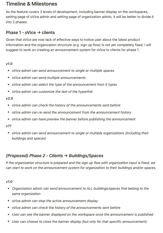
After speaking to stakeholders and users, we worked on a feature brainstorm and product requirements document among the Product Managers, Design, and Engineering teams. We collaborated to decide on our MVP version 1 of this Announcement portal, and help us differentiate from our “needs” versus “nice to haves”, along with troubleshoot any technical limitations or difficulties.
Brainstorming Product Requirements
Hi-Fi Screens and Iteration
With the urgency needed for MVP, we went straight to Hi Fidelity Design for Banners and Announcement Creation, and would continue to iterate on the design after implementation. A few examples of Hi-Fi screens showing both the user facing and internal member facing sides are shown below. Designs were first created in English as a universal standard, and then tailored per language.
Announcement Banner View (User Facing)
Banner Types (English/ Korean/ Japanese)
Banner Components
Empty Space (No Active Announcements)
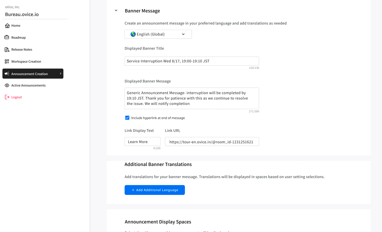
Announcement Creation Page
Select Announcement Type
Announcement Information and Link
Adding Additional translations
Japanese Translation View
Adding/Deleting Announcement Translations
Adding Client Spaces for Announcements (Grouping/ Space ID #)
Space ID Selection and Preview
Publish Announcement Modal
View of Ongoing Active Announcements
View of multiple active announcements and stopping banner publication
View of Open Accordion Information for Spaces
Ending Active Announcement Modal
Challenges and Learning Points
Although we had worked together to create a Product Requirement Doc, there were a lot of technical feasibility problems and scope creep to solve along the way. This caused for some rework, but in the end, open communication kept each team happy.
Designing for Multiple languages including single alpha-numeric vs double byte characters lead to interesting discussions on maximum characters in each language. This discussion would eventually lead to added rules in our design system, and the decision to continue with Relative Em. For this project, we maintained that each language have the same maximum amount of characters.
Initially, there was push back from business stakeholders to remove the “close” button to our banner, to ensure the message was visible to the user at all times. This was a great thing to test with a small amount of users (beta trial users) as immediately we were receiving feedback of a bug in our banner, or frustration that the banner was covering parts of a user’s workspace, and rendering it unusable. We were then able to agree as a whole to keep the “close” button.
Future Iterations
With the next stage rollout, I’d like to consider the following:
Start delving more into pre-scheduled announcements that can start/end at a specific time.
Allow the ability to create templates for the teams to work quickly from, and be able to save them for future use.
Add the ability for our CS team members to pause an active announcement, and restart it at a later time if needed.
Add this ability for oVice Admin Users to make announcements to their own spaces.
